| Journal | Paint Blended Hepplewhite Dresser
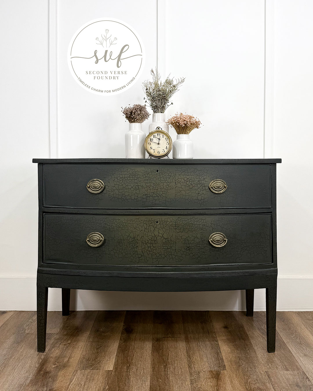
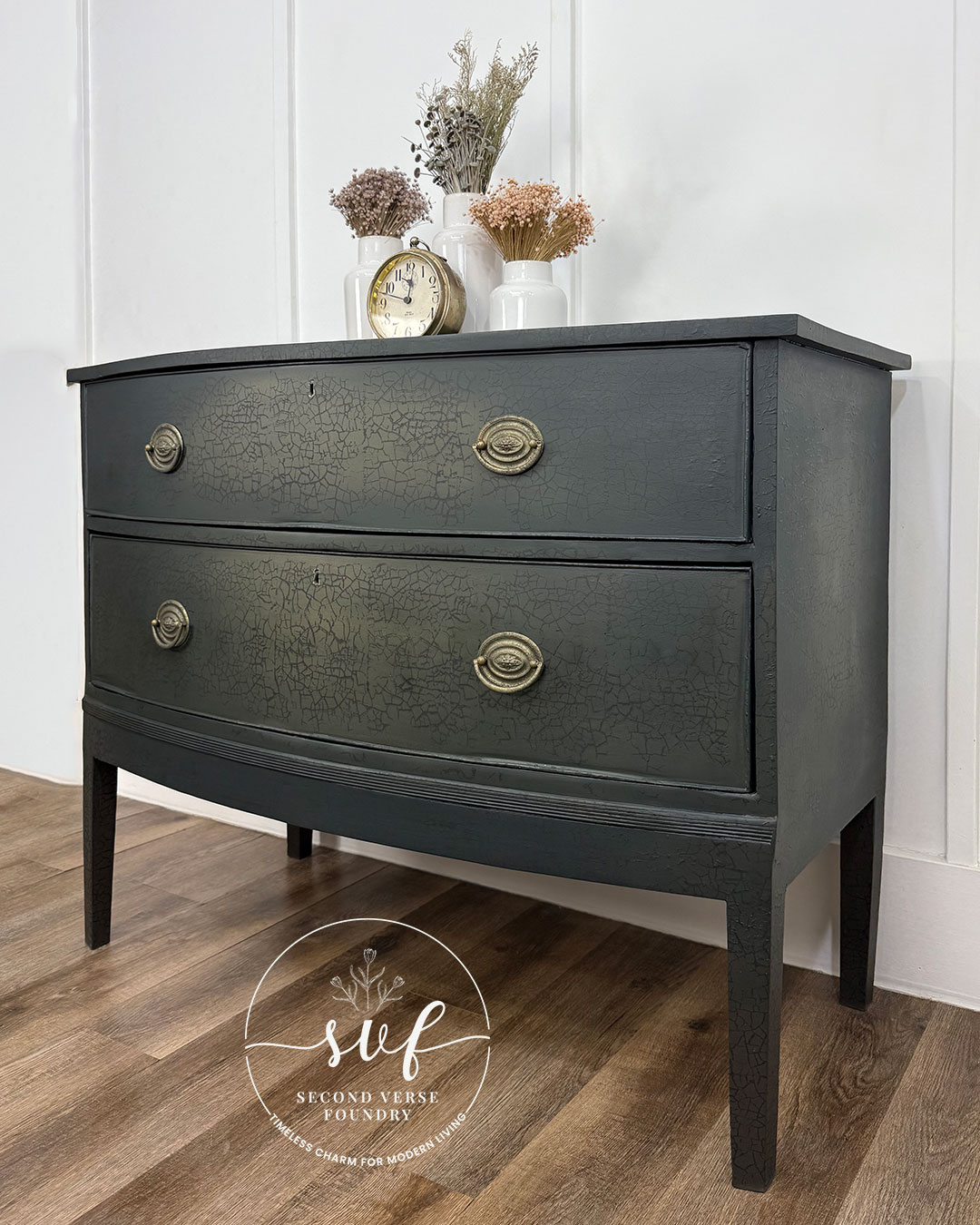
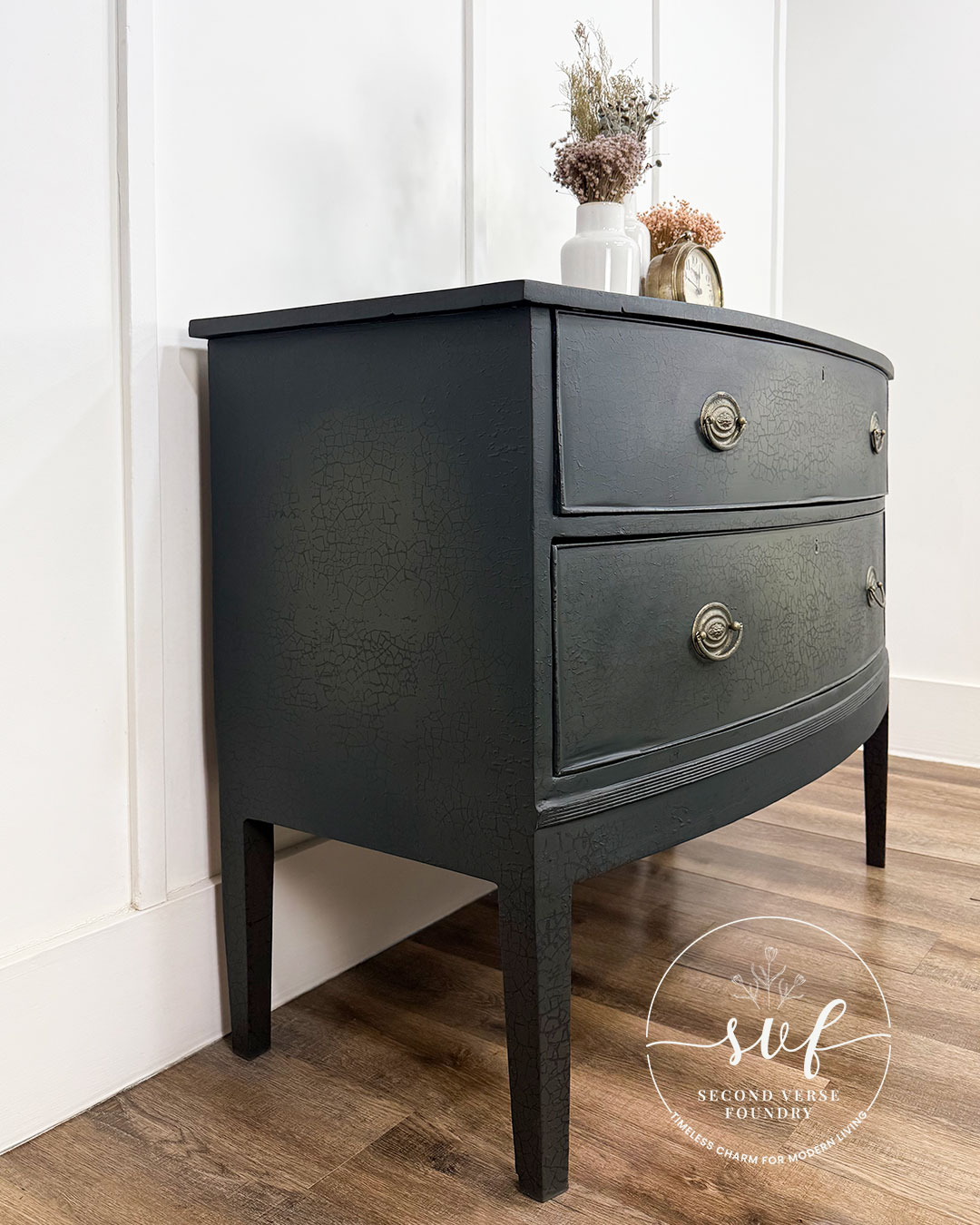
Moody & Modern— Hepplewhite Bow Front Dresser

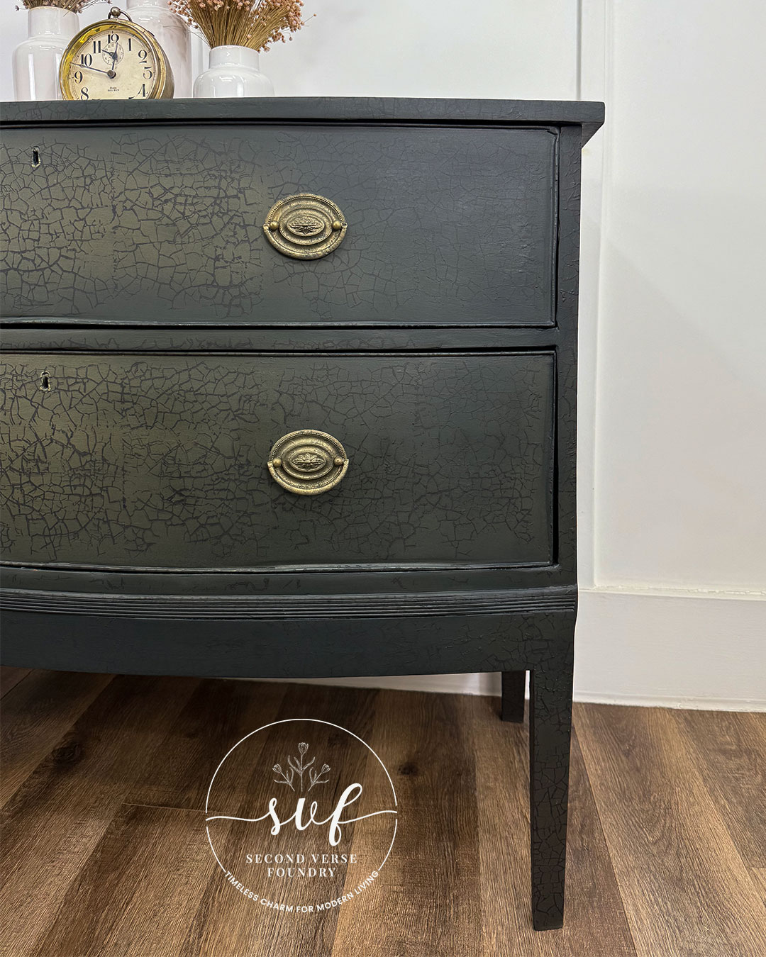
This Hepplewhite dresser had all the makings of a standout piece—classic bow front, timeless lines, and plenty of potential. The damage was plentiful, but nothing a little Bondo and elbow grease couldn’t fix. I envisioned a moody, rich finish—something bold yet versatile—so I reached for some Country Chic Paint products and got to work. Blending deep green with dark brown and touches of bronze and gold metallic, I built up layers of depth and dimension, giving this piece a whole new feel—rich, warm, and full of character.
Paint Blended Hepplewhite Dresser
When a past customer offered me this Hepplewhite dresser, I didn’t hesitate. I love when a piece finds its way to me through someone who knows my style. This one had history, character, and plenty of wear—right up my alley. With repairs in order and a fresh vision in mind, I got to work, focusing on texture, movement, and a finish that felt both bold and timeless.


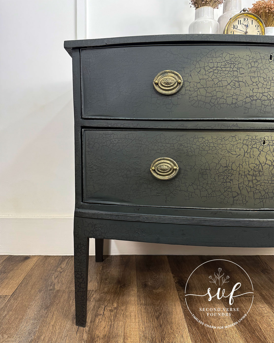
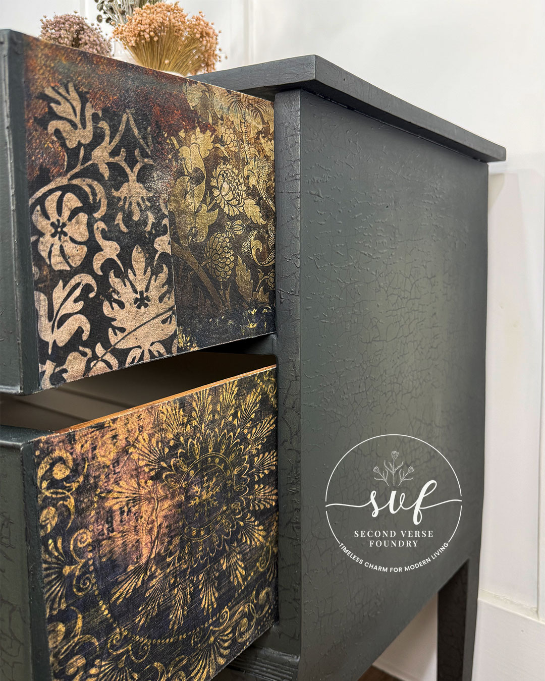
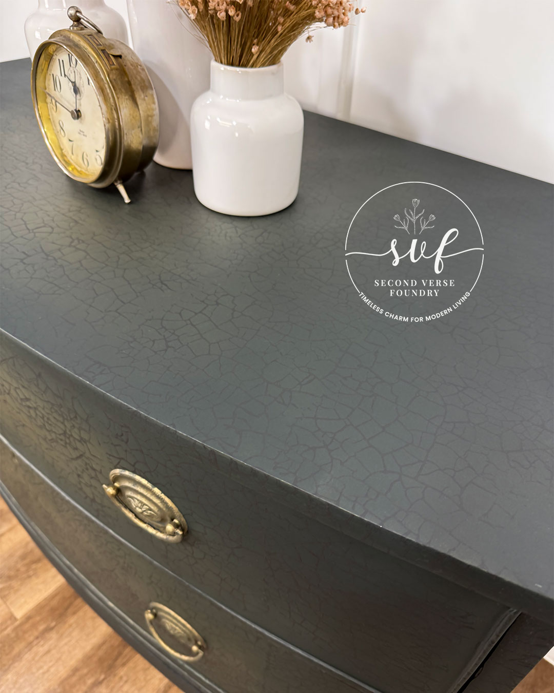
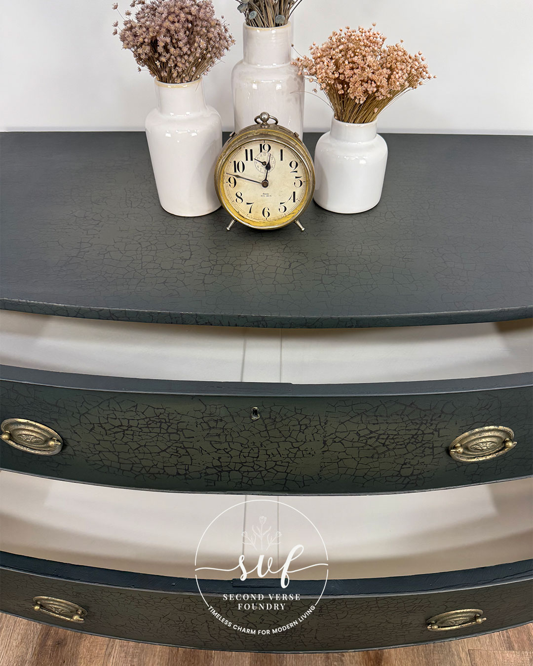
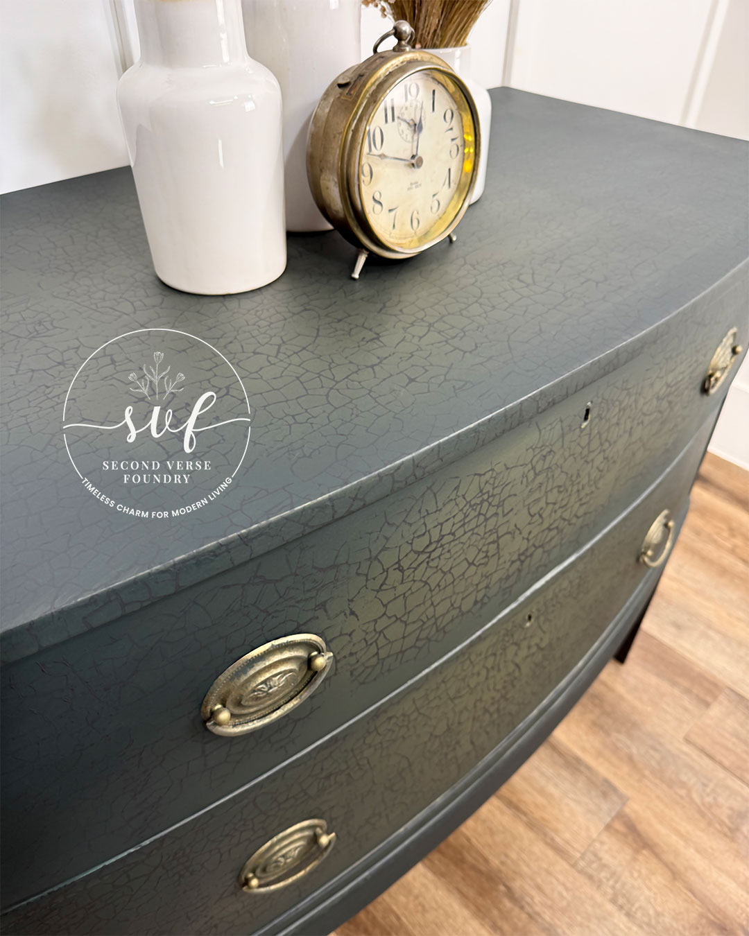
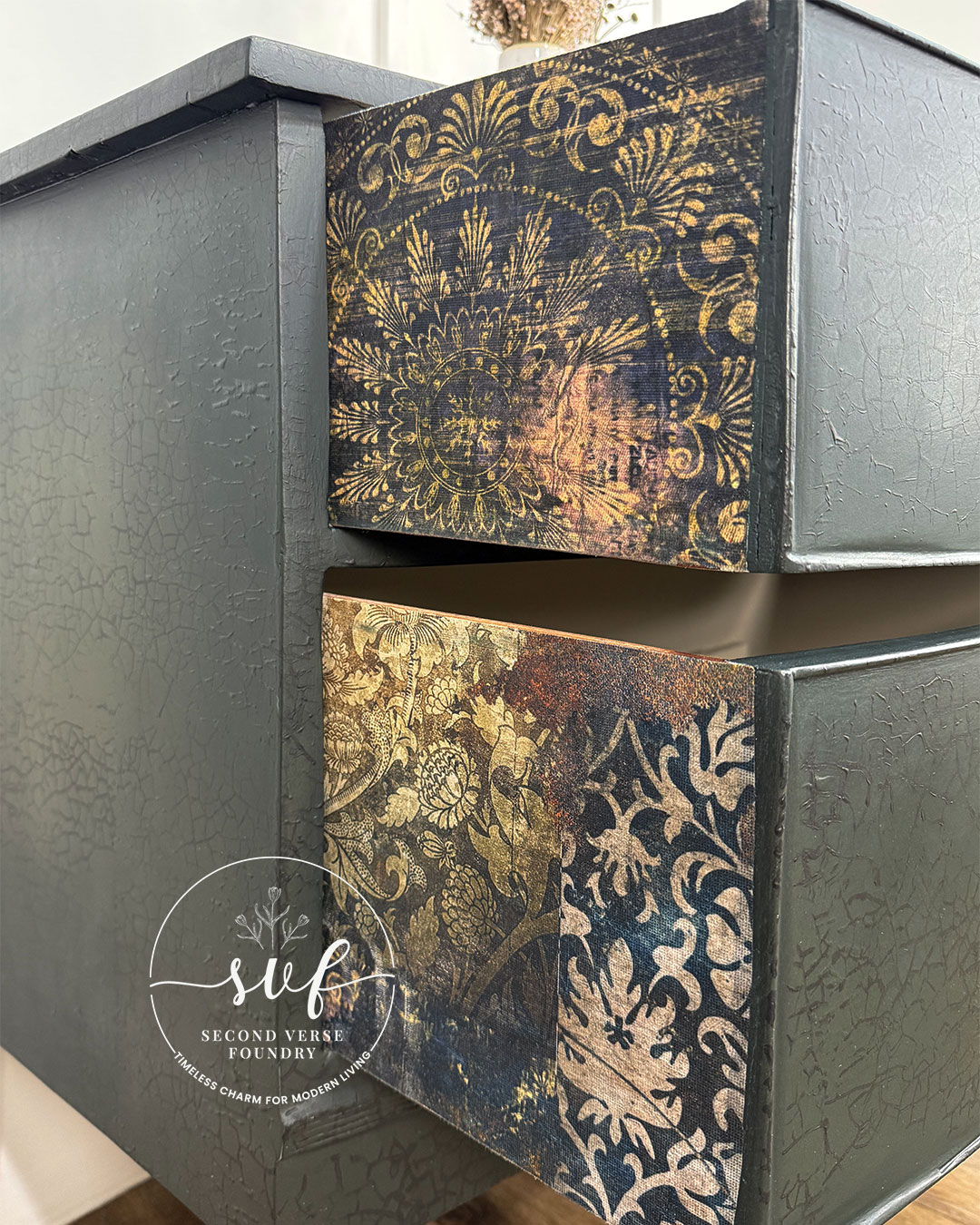
A Hepplewhite bow front dresser like this doesn’t come along every day, and I couldn’t pass up the chance to help it sing its second verse. With its distinctive curved front and timeless proportions, this piece was the perfect canvas for a bold yet versatile redesign. The deep, moody green and warm, earthy undertones make it a natural fit for a space with rich wood tones, neutral textures, or an eclectic mix of old and new. As a finishing touch, I lined the drawer sides with a soft, vintage-damask decoupage print, adding a little unexpected charm where you’d least expect it. A last-minute decision to add a crackle pattern gave the finish even more depth, bringing just the right touch of timeworn texture. Whether styled in a cozy bedroom, a curated entryway, or as a statement piece in a living area, it’s ready to settle in and make itself at home.

All products mentioned in this post—and every post I share—are ones I regularly reach for. They’ve earned a spot in my toolbox because they’re reliable and deliver results. Simply what I use, trust, and recommend, shared honestly with you. No affiliate links, no commissions—just straight talk from my whole heart.
Country Chic Paint / ReDesign with Prima
Featuring
These are the products that brought this transformation to life—ones I trust, recommend, and share honestly with you. Select any to explore other projects for inspiration and see where to buy.


Take a Closer Look
My Step-by-Step Transformation
These are the steps that brought this transformation to life—shared to guide and inspire your own project. Learn better by talking it through? Let’s connect for a consultation to bring your vision to life.
- Repaired damaged areas with Bondo — To rebuild missing trim details and mend structural imperfections; sanded smooth while allowing for natural character
- Lightly sanded down entire piece — In preparation for paint application; 80, 120 grit
- Thoroughly vacuumed and washed — Necessary preparation for any and all furniture restorations
- Applied 1 coat of Zinsser B-I-N Shellac to drawer interiors and structures — To prevent anticipated bleed-through; brush application
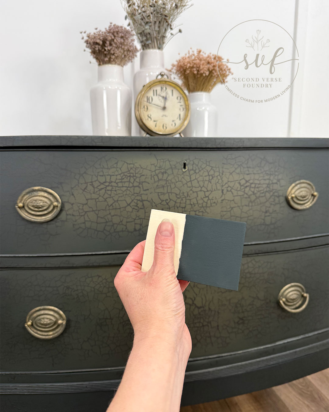
- Applied and blended 3 coats of Country Chic Paint in a new colour launching this Spring with the colour Dark Roast and a custom mix of Metallic Cream in Belt Buckle and Gold to the body and drawer fronts — Using wet-brush, dry-brush, and misting techniques; lightly sanded with 220 grit between coats
- Applied 2 coats of Fusion Mineral Paint in the colour Chateau to the drawer interiors and structures — For a clean and cohesive finish; brush application
- Applied a pattern with Redesign with Prima's 'Imperial Crackle' decor stamp with Country Chic Paint in the colour Liquorice to the entire exterior for additional dimension and texture— paint roll and stamp application
- Applied 1 coat of Country Chic Paint Natural Wax to the entire exterior — For a butterliciously soft protection and finishing seal; brush/lint-free rag application
- Added layers of both Country Chic Paint and Metallic Cream to the Hepplewhite pulls — For a rich, aged patina with depth and dimension; brush application with light 220 grit sands between coats
- Decoupaged drawer-sides with Re-Design with Prima’s WASHED DAMASK ~ a lovely pattern that I felt paired so nicely with this transformation; sponge/water-based poly application
- Applied 1 coat of Rustoleum Painter’s Touch to the entire exterior — For added protection; spray application
One-Hour / One-on-One / $80
Looking to achieve a similar look? Getting started with furniture transformations can feel overwhelming, but with hands-on experience since 2017, I’ve learned so much along the way. I’d love to share what I know and help guide you through the process.
Let’s work together! Whether it’s over the phone, via a screen-share session, or even over a coffee (or wine!), we’ll make a plan to bring your vision to life.
With all my heart and hands
This Hepplewhite bow front dresser had years of wear behind it, but its shape and structure were worth the effort. Now, with its moody finish, subtle crackle, and vintage-damask drawer sides, it has a whole new presence—bold yet grounded, refined yet full of character.
Every layer of blended colour, every bit of texture added along the way, was about creating something that feels intentional and storied. The process isn’t about following a formula—it’s about trusting the vision, letting the piece guide the way, and knowing when to stop.
Well-made furniture doesn’t need to be perfect to be worth saving. The curves and craftsmanship of this dresser gave it a strong foundation, but it was the redesign that made it stand out.
It may have started as a well-worn piece, but now it has a richness that fits seamlessly into a home that values character. The right colours, the right layers, and a fresh perspective can turn something overlooked into something that just feels right.
Faye Caroline
Omg so beautiful
Thank you so kindly Wanda! I don’t know what’s gotten into me… but seems like EVERYTHING I do lately has this new found attitude… “oh what do I got to lose, just try it girl!”… so glad I gave stamping a try… was the last touch I added to this redesign, and I’m swooning over the result… AND this new colour that Country Chic Paint will be releasing this Springtime is hands down the darkest green this girl ever did see… TIMELESS and oh so moody and modern! <3